

The modern convention of making soccer kit launches big events makes very little sense in the Twitter age, as nearly every single kit has been leaked at some point. So there was very little suspense among Arsenal fans when it came to the first Puma design. But that didn’t stop the club from making the reveal of their first PUMA kits an insane spectacle. It was dubbed the “Arsenal/Puma Kit Trilogy.” If only the kits were as epic as the name.
With Puma taking over from Nike, the company was always going to make a big deal out of their first big club in England. And as Arsenal got a lot more money out of Puma than they did from Nike – Puma will be paying Arsenal £30 million annually, while Nike only payed £8 a year – it made sense that they would try and please the company from the start. Arsenal’s website has been a big advertisement for Puma lately, and the Alexis Sanchez transfer even got buried beneath Puma stuff. It’s all a bit ridiculous.
But their launch today was downright strange. For those around the world, there was a Live Launch Video on Youtube that consisted of a 30 minute countdown (one that didn’t even count down the entire time – see the 8 minute mark of the video for when it counts up) and less than three very strange minutes of vaguely discernible holographs projected onto water in front of the London Eye with Arsene Wenger doing his best Morgan Freeman impersonation. Watch the video for yourself, it’s extraordinarily strange. I can’t imagine what being there would have been like.
The kits themselves aren’t as bold as I would have expected from Puma. And while it’s refreshing to see new designs after watching so many generic Adidas and Nike looks dominate the EPL recently, I don’t particularly like this new Arsenal set.
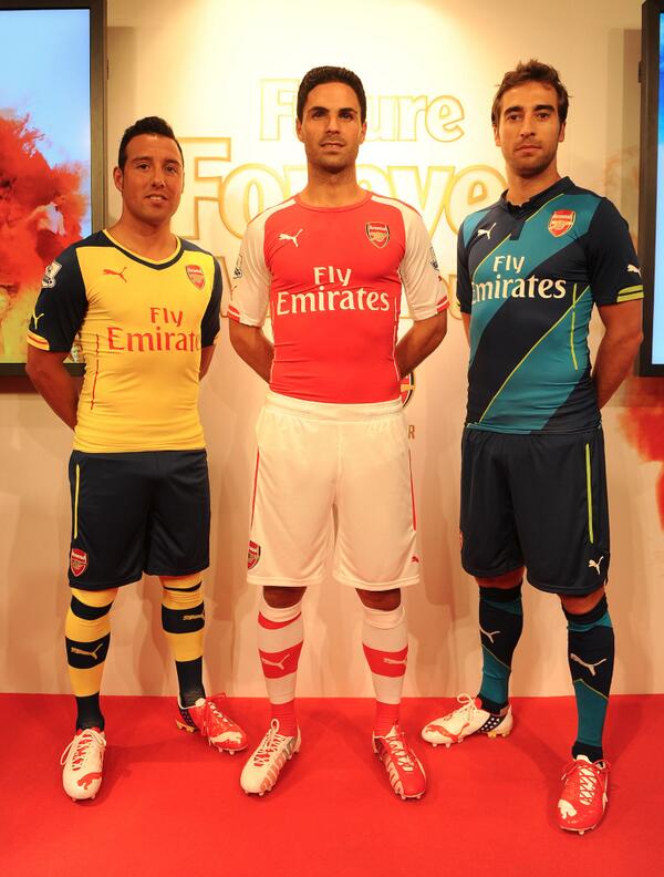
Here are all three looks for the 2014/15 season
The Home Red
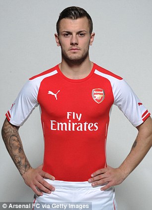
The kit that we will see the most of is not particularly aesthetic to the eye. The shoulder panels are awkward, unable to decide if they should be rounded or straight. Ever since this jersey leaked months ago in a photo with Thierry Henry wearing it, I have not been looking forward to seeing it on the field. However, I do like the little bit of red on the cuffs of the sleeves. It’s a nice, subtle touch. The random piping on the side seems unnecessary though. In general, I don’t like jerseys to be overly tight, and Puma has had a tendency of doing that for soccer jerseys. Out of the three new Arsenal designs, this one could be the most susceptible to that dreaded too tight look. The socks and shorts are nice enough, but overall, this primary strip is disappointing as Puma’s first effort.
The Away Yellow
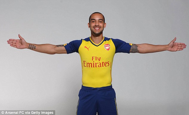
This design harkens back to previous Arsenal looks more than the others. The yellow and navy work well together here, but a slightly brighter blue like the one used in this past season’s away strip might have been better. I think the shoulder and sleeve design looks a lot cleaner than it does on the home, albeit significantly harsher, but it’s interesting Puma didn’t settle on one consistent look. The whole design is rather simple, but the little bit of yellow on the sleeve makes a boring design slightly less so. Once again, the random navy piping on the sides is worthless. The shorts are pretty standard, but the yellow and navy stripes on the socks look sharp.
The Alternate Blue
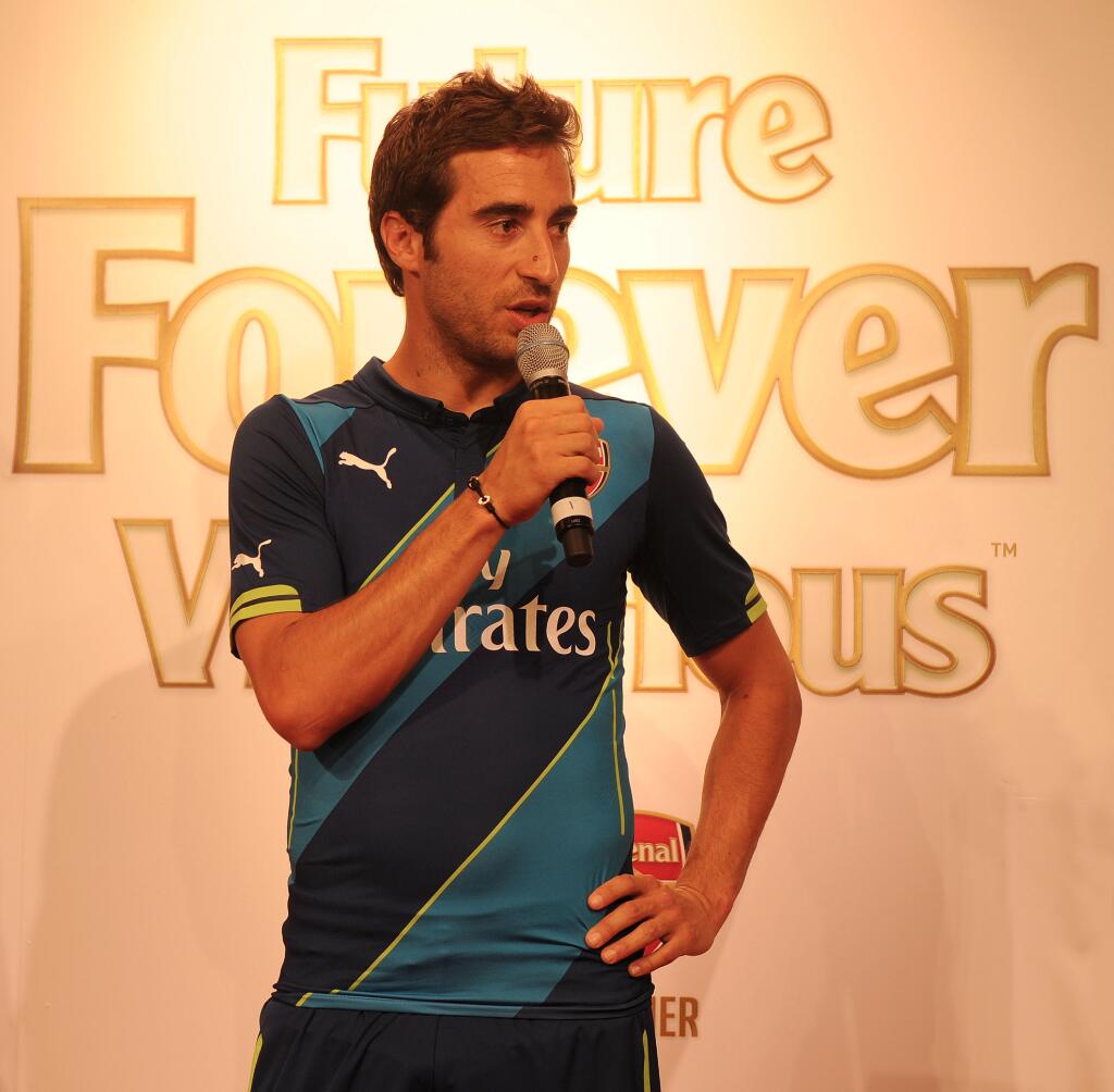
I’m generally not a fan of having an entirely new third kit, but with Arsenal not having a third Puma option, this one was necessary. Out of the three though, this look may be my favorite. The diagonal stripes across the front are handsome, and while the kit is similar to Nike’s 2011/12 design, it’s much nicer. The touch of lime-green helps bring out the stripes, and for once, I think the side piping kind of works because it’s a third color. If the shorts are different than the away kit’s, it’s hard to tell, but the socks are an entirely different design. I prefer the stripes of the others to the blocky look of this one, but overall, they aren’t a disaster. It’s a pretty classic kit, and I hope Arsenal gets to wear it more than a couple times.
With inspiring mottos like “Future Forever Victorious” and “Stronger Together,” many would have expected something more akin to the Star Wars trilogy than the Arsenal Puma Kit Trilogy. But at least we were spared the misery of another kit introduction later on for the third strip. I guess I should be thankful that the money from the Puma contract helped bring Alexis Sanchez to Arsenal, but these kits don’t seem all that revolutionary to me.

July 23, 2014 at 9:39 pm
The third kit actually has a neon-green as its accent colour and not the yellow you meantioned.
July 23, 2014 at 9:47 pm
Thanks for pointing that out. That green is such an odd color for Arsenal to use that I assumed it had to be yellow
July 26, 2014 at 2:56 pm
Brilliant post…and here I thought I was the only one who hated the first kit.
I actually do like our away yellow though..
the neon green…*cringe* ugh!!
July 30, 2014 at 2:17 am
As a fellow Arsenal fan, I like the third kit. I know, I know, shame on me. I’ll still be bringing out the classic kits for match days though. The question hangs…favourite Arsenal kit ever?
July 30, 2014 at 3:26 am
Good read mate
July 31, 2014 at 4:02 am
Good read! Hope they’re lucky with their injuries.
August 8, 2014 at 2:56 pm
The kits are rather more slim fit, but i suppose it’ll drive me to go to the gym more often! lol
August 11, 2014 at 5:59 am
I think those random strips on the sides are more functional than design. Heat strips I think? They explained the kits in a video.
Pingback: Wild American Gooner’s 1st Birthday – Time For a Look Back | Wild American Gooner